
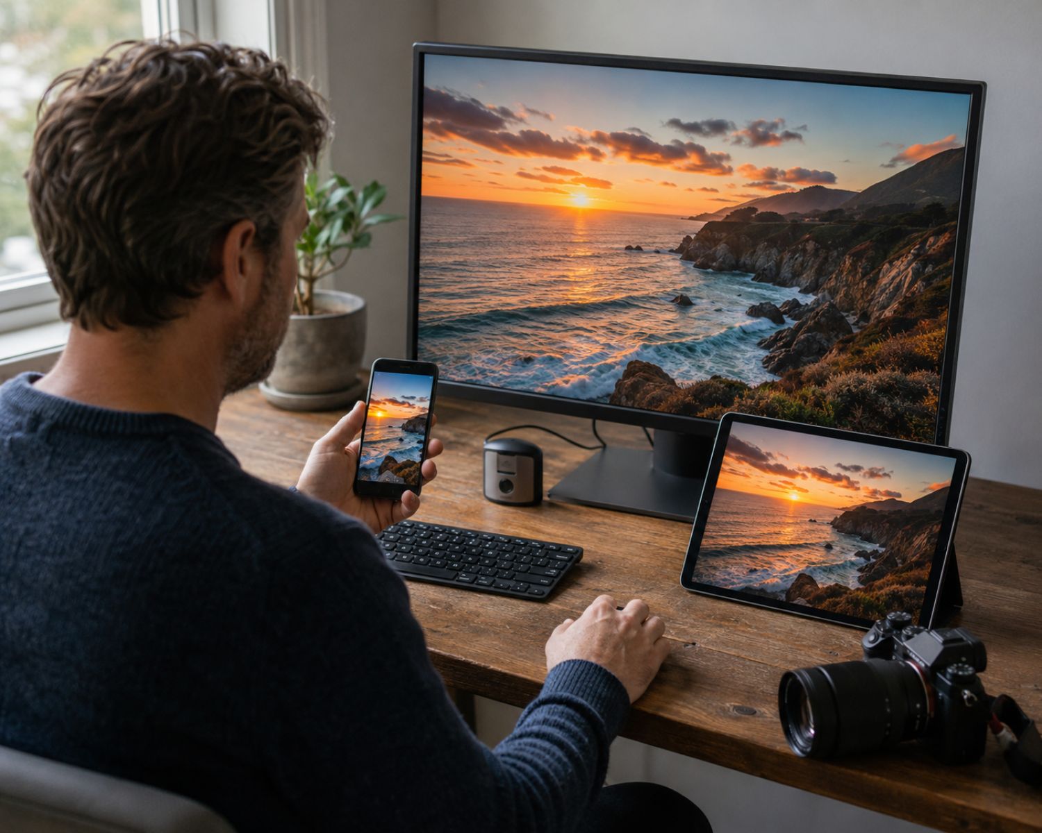
A photograph can look rich and balanced while you edit it, then appear dull, oversaturated or strangely warm after you upload it. The file has not necessarily been damaged. The problem often lies in how different devices and platforms interpret colour.
Every digital image uses a colour space that defines the colours it can describe. Your monitor, software, export settings and the viewer’s screen all influence the result.
Understanding this chain helps you produce images that remain more consistent across websites, phones and computers.
Understand the Main Colour Spaces
sRGB is the safest colour space for most websites and social platforms. Its range is smaller than some alternatives, but browsers and devices widely recognise it.
Adobe RGB contains a wider range, particularly in greens and cyans. It can be useful for certain printing workflows, although an Adobe RGB image may look flat when a platform ignores or removes its profile.
Display P3 offers a wider range than sRGB and is common on newer devices, although support varies between applications.
Separate Editing Space From Export Space
Working in a wide colour space gives editing software more information to preserve while adjustments are made. That does not mean the final online file should remain in that space.
Photographers sharing images through Lovely Lens should create a dedicated web export instead of uploading a master prepared for printing. This preserves the original while producing a suitable online version.
For web use, convert the image to sRGB during export. Conversion recalculates colours so they fit the destination space. Simply assigning an sRGB label without converting the colours can cause an unexpected shift.
Embed the Colour Profile
An embedded profile tells compatible software how the file’s colour values should be interpreted. Without that information, an application may guess, often assuming that the image uses sRGB.
Embed the colour profile when exporting. It adds little file size and guides colour-managed browsers and applications.
Some platforms strip metadata during compression. Starting with an sRGB file reduces the risk of severe changes if the embedded profile is removed.
Check Your Monitor Before Blaming the Platform
A bright or highly saturated monitor can encourage you to create edits that look dark or weak elsewhere. Calibration helps the display represent colour and brightness more predictably.
Hardware calibration is most accurate, but basic controls can improve an incorrect display. Avoid editing at maximum brightness, particularly for photographs that may be printed.
Also disable display features that automatically change colour temperature according to the time of day. They may make accurate editing difficult even when the monitor has a suitable profile.
Choose Sensible Export Settings
Export online photographs as JPEG files in sRGB unless a platform requests something different. Select a quality setting that limits visible compression without creating an unnecessarily large file.
Resize the image to the platform’s recommended pixel dimensions and apply moderate output sharpening for screen viewing. Repeatedly saving the same JPEG can reduce quality, so export a fresh copy from the master file whenever possible.
Test the Published Image
Open the exported file in more than one browser or device before publishing. After uploading, compare the live version with the local export rather than only with the editing preview.
Perfect consistency is impossible because every screen differs. However, an sRGB conversion, embedded profile, calibrated display and controlled export workflow will prevent the largest surprises. When colour matters, test the exact file your audience will see.
#ColourManagement #PhotoEditing #ColourSpaces #SRGB #PhotographyTips #DigitalPhotography #ExportSettings #MyLovelyLens
